2023 American Graphic Design Award
"Designing For Good" Category
"Designing For Good" Category
Love, Period.
Promoting Guerrilla Kindness
Promoting Guerrilla Kindness
The Project
Full brand identity, website, product & packaging design
Full brand identity, website, product & packaging design
About The Company
"The Love Period Campaign is a mission-driven company dedicated to improving the social outlook in our communities. We seek to change the way people view themselves, each other, and society as a whole, by shifting the focus away from the negative, and encouraging kindness and human decency. We take a no-nonsense approach to intentionally caring for other human beings whether we know them, like them, agree with them, or not. When we look for the good in the world and each other, we find it. What we focus on becomes our reality. The Love Period Campaign's hope is to remind people to see the good in others, and to be the good society needs."
"The Love Period Campaign is a mission-driven company dedicated to improving the social outlook in our communities. We seek to change the way people view themselves, each other, and society as a whole, by shifting the focus away from the negative, and encouraging kindness and human decency. We take a no-nonsense approach to intentionally caring for other human beings whether we know them, like them, agree with them, or not. When we look for the good in the world and each other, we find it. What we focus on becomes our reality. The Love Period Campaign's hope is to remind people to see the good in others, and to be the good society needs."
Website
loveperiodcampaign.com
loveperiodcampaign.com
Brand Inspiration
Logo
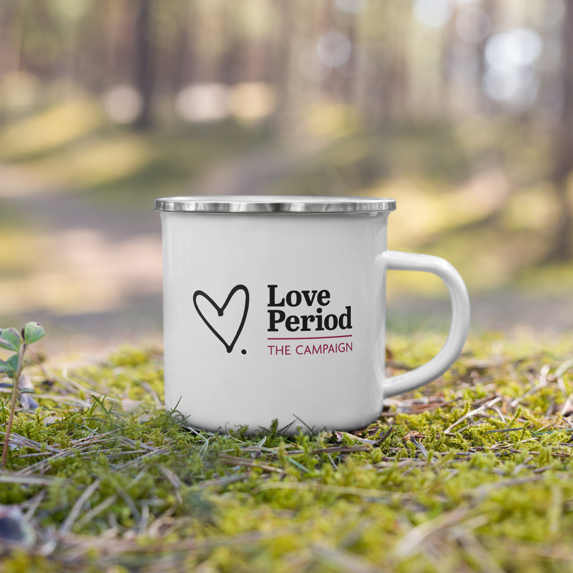
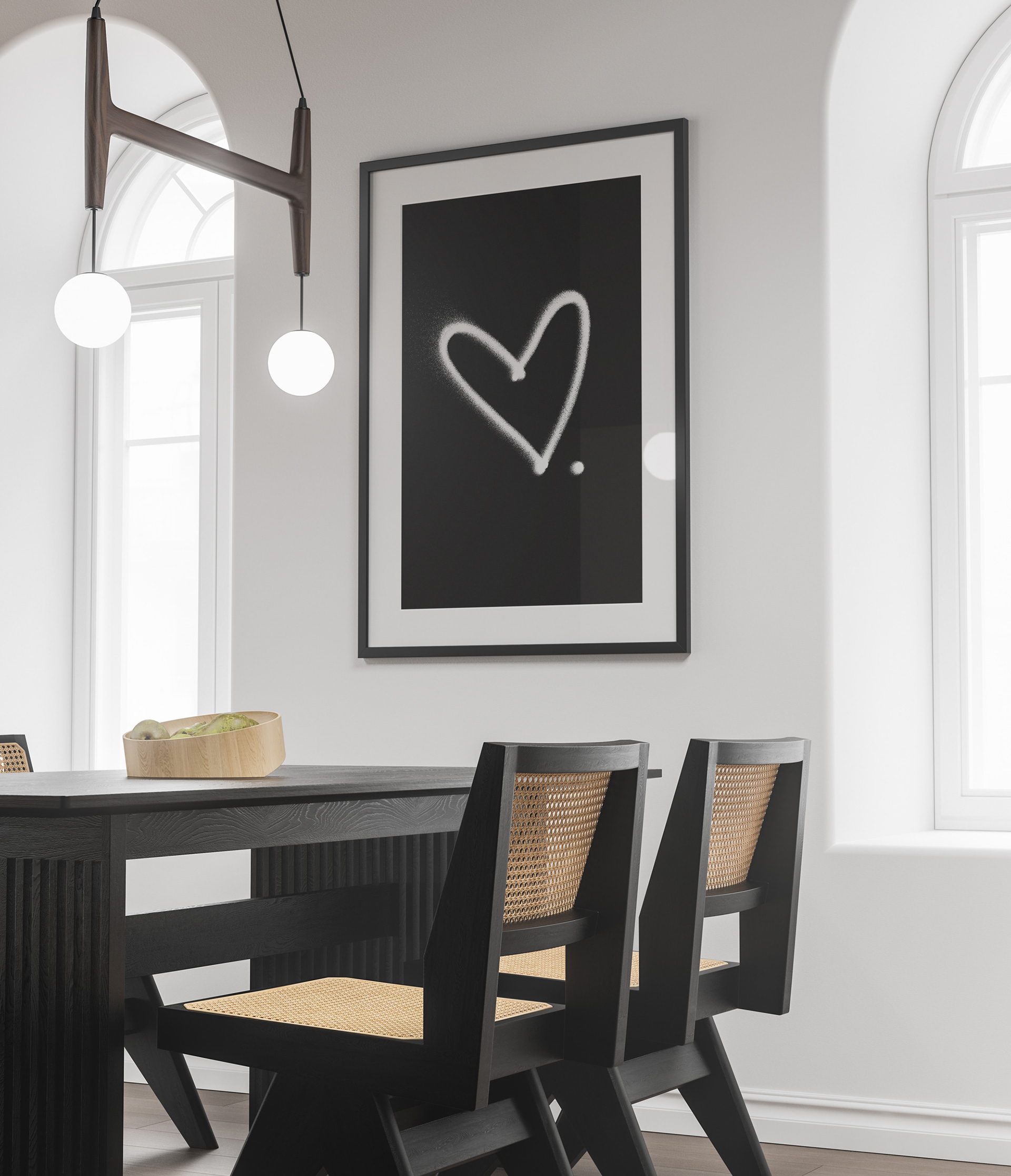
What started as a social media campaign for World Kindness Day became the basis for this company. The campaign consisted of a simple illustration of a heart with a period, and a call to tag people and post something kind about them. This illustration would naturally become the logo, and the star of most of the products. The simplicity of the illustration, and immediacy of the message, said everything that needed to be said.
What started as a social media campaign for World Kindness Day became the basis for this company. The campaign consisted of a simple illustration of a heart with a period, and a call to tag people and post something kind about them. This illustration would naturally become the logo, and the star of most of the products. The simplicity of the illustration, and immediacy of the message, said everything that needed to be said.
Visual Identity
Because the nature of the campaign was ultimately about spreading kindness in the form of universal truths -- things we can say about the value inherent in all human beings -- I drew inspiration from newspapers for the visual identity. The old-school, came-to-your-doorstep, newspapers. Sort of a way of declaring to the world that these kind words being said are factual and true. I kept the majority of the imagery black and white to keep in line with typical newspaper photos, and added a halftone effect and gradient map to mimic traditional printing methods. The black-and-white imagery also draws attention to the feeling, or meaning, behind each photograph, without the distraction of color.
Because the nature of the campaign was ultimately about spreading kindness in the form of universal truths -- things we can say about the value inherent in all human beings -- I drew inspiration from newspapers for the visual identity. The old-school, came-to-your-doorstep, newspapers. Sort of a way of declaring to the world that these kind words being said are factual and true. I kept the majority of the imagery black and white to keep in line with typical newspaper photos, and added a halftone effect and gradient map to mimic traditional printing methods. The black-and-white imagery also draws attention to the feeling, or meaning, behind each photograph, without the distraction of color.
Color Palette
The color palette was kept very neutral in line with the "no-nonsense" brand personality. I used newspaper greys, and a soft charcoal black, to keep the black-and-white theme from appearing too stark, and invoke a softness and warmth to the overall feel of the brand. I included pink as an accent color, using a more sophisticated shade, as this is an assertive, down-to-business company, without frills.
The color palette was kept very neutral in line with the "no-nonsense" brand personality. I used newspaper greys, and a soft charcoal black, to keep the black-and-white theme from appearing too stark, and invoke a softness and warmth to the overall feel of the brand. I included pink as an accent color, using a more sophisticated shade, as this is an assertive, down-to-business company, without frills.
